Using Color Theory to Enhance Travel Photography Skills

Understanding Color Theory Basics for Photographers
Color theory is the study of how colors interact and influence each other. At its core, it helps photographers understand the emotional and visual impacts of color. For example, warm colors like reds and oranges can evoke feelings of excitement and energy, while cool colors like blues and greens often create calm and serenity.
Color is the keyboard, the eyes are the harmonies, the soul is the piano with many strings.
By grasping these concepts, you can make more informed decisions about your composition and subject matter. This knowledge empowers you to select colors that resonate with the story you wish to tell through your photographs. Imagine capturing a sunset with vibrant oranges and pinks to convey warmth, versus a foggy morning with muted blues to evoke tranquility.
Ultimately, understanding the basics of color theory creates a strong foundation for improving your travel photography skills. You'll begin to see the world through a more colorful lens, allowing you to capture dynamic and compelling images that stand out.
The Color Wheel: A Photographer's Best Friend
The color wheel is a visual representation of colors arranged according to their hues. It serves as a handy tool for photographers to understand color relationships and harmonies. For instance, complementary colors—those opposite each other on the wheel—create striking contrasts that can make your images pop.
Using the color wheel, you can experiment with different color combinations to enhance your photos. For example, pairing blue and orange can create a vibrant and eye-catching scene. This approach not only adds visual interest but also guides the viewer's eye through your image.
Color Theory Enhances Photography
Understanding color theory helps photographers evoke emotions and improve their composition.
Incorporating the color wheel into your photography practice helps you develop a keen eye for color dynamics. By understanding how to balance and contrast colors, you'll be able to create more engaging and aesthetically pleasing travel photographs that resonate with your audience.
Warm vs. Cool Colors: Setting the Mood
Warm colors, such as reds, yellows, and oranges, tend to grab attention and evoke strong emotions. If you're photographing a bustling market or a lively festival, using warm colors in your composition can amplify the energy of the scene. Think about capturing the rich hues of spices or vibrant decorations that make your images come alive.
Colors are the smiles of nature.
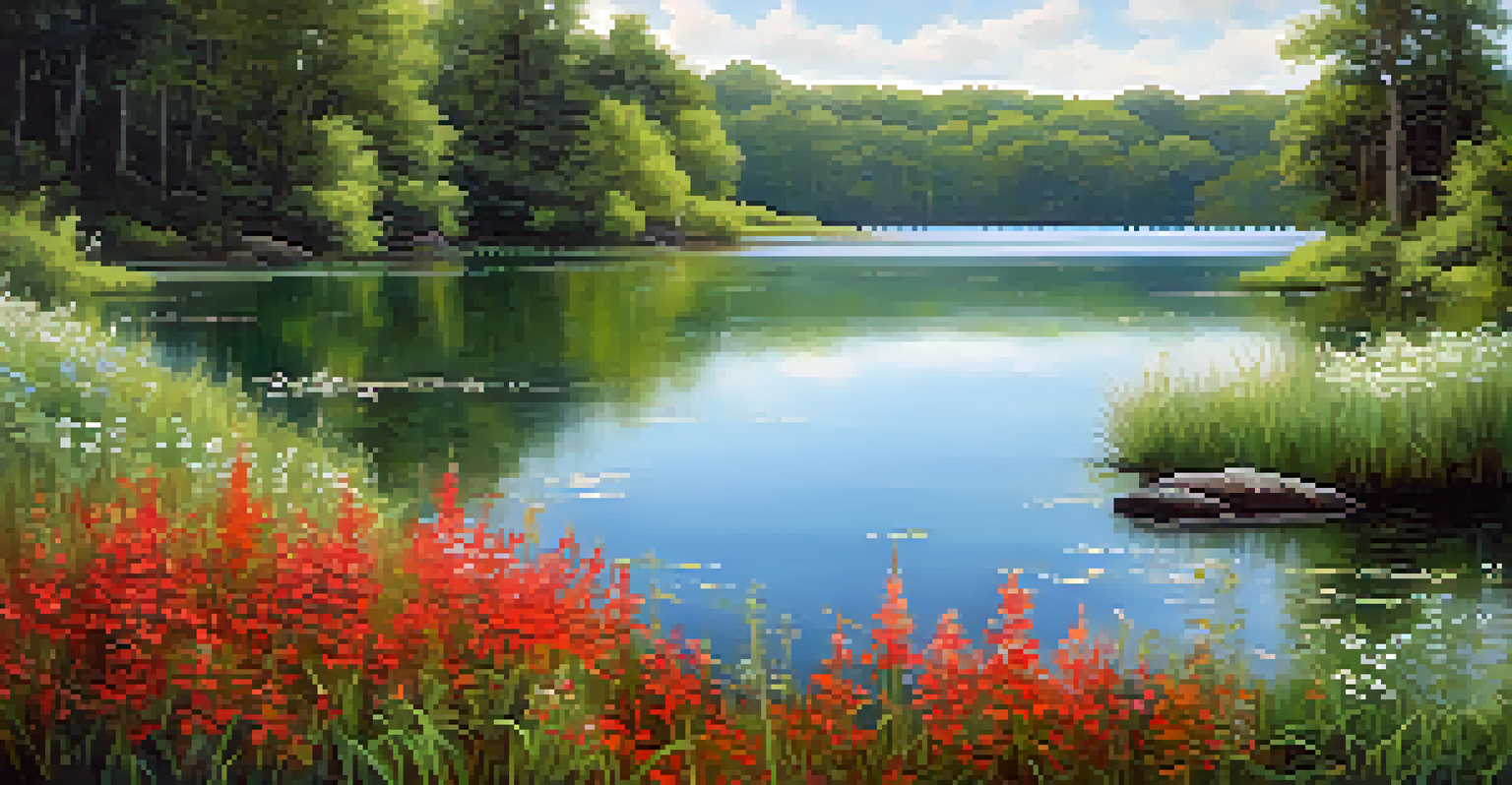
On the other hand, cool colors like blues, greens, and purples can evoke feelings of calmness and tranquility. If you're photographing serene landscapes or quiet moments, incorporating these colors can create a peaceful atmosphere. Imagine snapping a picture of a tranquil lake surrounded by lush greenery; the cool tones will enhance the sense of calm.
By thoughtfully choosing between warm and cool colors, you can effectively set the mood of your photographs. This ability to manipulate emotions through color gives you greater control over the narrative you wish to convey in your travel photography.
Using Color Contrast to Create Dynamic Images
Color contrast is a powerful tool in photography that helps your subject stand out against the background. High contrast images, which combine bold colors, can create a striking visual impact. For example, a bright red umbrella against a rainy, grey backdrop draws the viewer's focus and tells a compelling story.
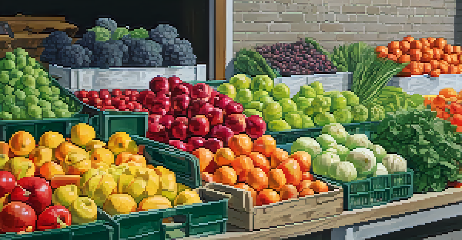
In travel photography, utilizing color contrast can highlight cultural elements and unique features of a location. Think of photographing a colorful market stall filled with fruits against a dull brick wall; the contrast will emphasize the vibrancy of the produce and the local culture. Such techniques can transform ordinary shots into captivating art.
Use the Color Wheel for Harmony
The color wheel aids photographers in creating striking contrasts and harmonious color combinations.
Mastering the use of color contrast can elevate your photography skills. By experimenting with contrasting colors, you can create images that not only catch the eye but also leave a lasting impression on your audience.
The Role of Color in Composition and Framing
Color plays a crucial role in composition and framing, guiding the viewer's eye throughout your image. By strategically placing colors within your frame, you can lead the viewer's gaze to the focal point of your photograph. For instance, using a path lined with colorful flowers can draw attention to a scenic view at the end.
Additionally, varying color intensity can create depth in your images. For instance, foreground elements in vivid colors can add layers to your composition, while softer colors in the background create a sense of distance. This technique can be particularly effective in landscape photography or busy street scenes.
By consciously considering color in your composition, you can create more engaging and well-balanced photographs. This thoughtful approach helps convey your intended message while enhancing the overall aesthetic quality of your travel images.
Incorporating Natural Color Schemes into Your Shots
Natural color schemes refer to the harmonious color palettes found in nature that can inspire your photography. For example, the earthy tones of a sunset, the vibrant colors of a tropical beach, or the rich hues of autumn foliage all provide great palettes to draw from. By capturing these natural schemes, you can create visually cohesive and captivating images.
One effective way to incorporate these schemes is by focusing on the colors present in your environment. If you're in a lush green forest, look for contrasting colors like the bright reds of berries or the soft whites of wildflowers. This approach ensures your images resonate with the natural beauty of the location.
Post-Processing Elevates Images
Post-processing techniques allow photographers to enhance colors and bring their travel photos to life.
By embracing natural color schemes, you not only enhance your photography skills but also create images that reflect the beauty of the world around you. This technique allows you to capture moments that are both authentic and visually stunning.
Post-Processing: Enhancing Colors in Your Photos
Post-processing is the final step in refining your travel photos and enhancing their colors. Using photo editing software, you can adjust saturation, contrast, and brightness to bring your images to life. For example, increasing the saturation of a sunset can make the colors more vivid and emotionally impactful.
However, it's important to strike a balance; over-editing can lead to unrealistic images. Aim for enhancements that maintain the natural beauty of the scene while amplifying its visual appeal. Subtle adjustments often yield the best results, preserving the authenticity of your travel experience.
By mastering post-processing techniques, you can elevate your photography and create stunning images that reflect your unique perspective. This final touch allows you to showcase the beauty of your travels while applying your newfound understanding of color theory.